-
Dunn-Edwards 2026ɫ���OӋ����څ��ϵ�У�����ֵ���Pע������ɫ
2025/9/28 8:18:15����Դ:ؔӍ�W�������w���� �� С�����ղر��������ӡ�����P�]��
������ʾ���S���҂���ʾ��2026��ɫ��څ��ϵ��һ���o�k֮�����҂��l�Fһϵ�М�ů������ɫ�{Ҳ������ռ������Ҫ��λ���@�����҂���2026ɫ��څ��ϵ�ж���ֵ���Pע������ɫ��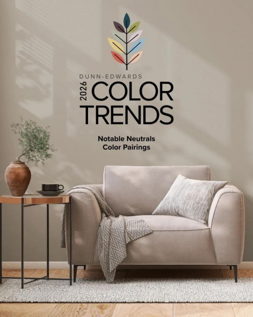
����ɼ���r�g2025��9��
���������۵��AƝ-Dunn-Edwards Paints
¡�ص��Ƴ���
Dunn-Edwards 2026ɫ��+�OӋ
����څ��Ӣ�İ�
���գ��҂����Ї�¡���Ƴ�ԓڅ�ݵ����İ档
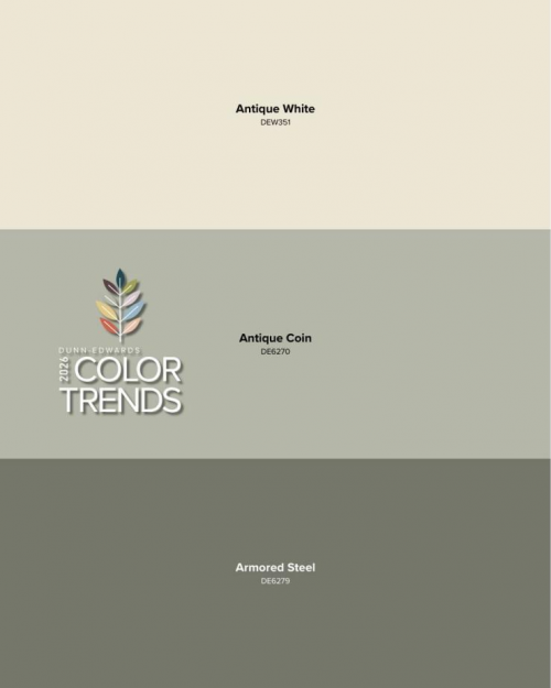
2026����څ�ݷքe��ɂ�ϵ��
ϵ��֮(һ)�o�k֮��
ϵ��֮(��)ֵ���Pע������ɫ
�����҂�Ԕ�����x����څ��֮
ϵ��(��)ֵ���Pע������ɫ��
�S���҂���ʾ��2026��ɫ��څ��ϵ��һ���o�k֮�����҂��l�Fһϵ�М�ů������ɫ�{Ҳ������ռ������Ҫ��λ���@�����҂���2026ɫ��څ��ϵ�ж���ֵ���Pע������ɫ���@Щ����ɫ�ʵ��N�S���ҌӴΏ��s���Ե��{���V�����ˑBÓ�f�������ܠI����O���������ı����Շ����Ҿ��c��������Ӵθе��Գ��չ�F���Ķ����OӋ�\��������
�@�˷N����עĿ������ɫ��2026��ɫ��څ��ϵ�Ю����ˈA�M�ľ�̖������ͨ�^�����ů����ČӴ��춨���g�Ļ��{��ʹ�ø����đ��ɫ���܉�Ó�f�������@Щɫ�{�N���|���Ϣ�c�����У���ӳ���˂�����߱��F���cο��е�ɫ�ʵ����������
As we uncovered the nature-inspired hues of the 2026 Color Trends and the quiet shift towards a more joyful, refined aesthetic, we found a set of warm neutrals also making their presence felt. Emerging with understated confidence, these rich and complex colors create an inviting backdrop that allows for subtle layering of furnishings and textures to beautifully enhance any design.
The eight notable neutrals round out the 2026 Color Trends collection by introducing warmth and subtle depth to anchor a space, allowing bolder hues to take the spotlight. These tones feel earthy and grounded, reflecting the growing desire for colors that are both expressive and comforting.
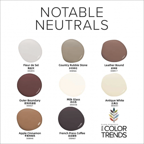
�oՓ�����ډ������w��߀���@���s�Ľ����������@Щ�ٴ������ɫ�����ṩһ�N���㽛��ķ�ʽ���F���g�Ľyһ�����@��ˇ��տ�������҃����m�к�����ĸ��{֮�g�I���������Ȼ��㕽ӡ�
Whether featured on walls or highlighting intricate architectural details, these versatile neutrals offer a timeless way to unify space, highlight craftsmanship, and create a seamless flow between indoor comfort and outdoor presence.
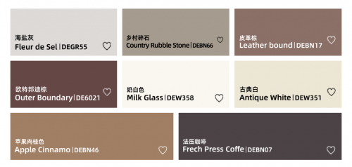
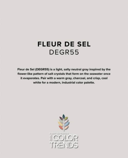
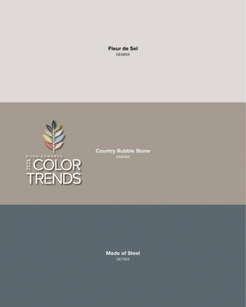
Fleur de Sel - ���}��| DEGR55
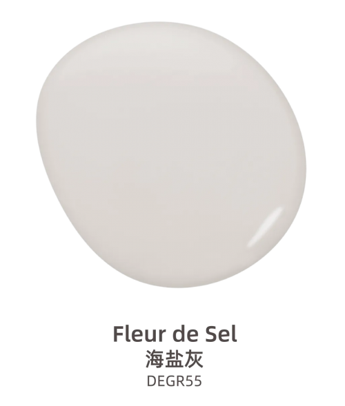
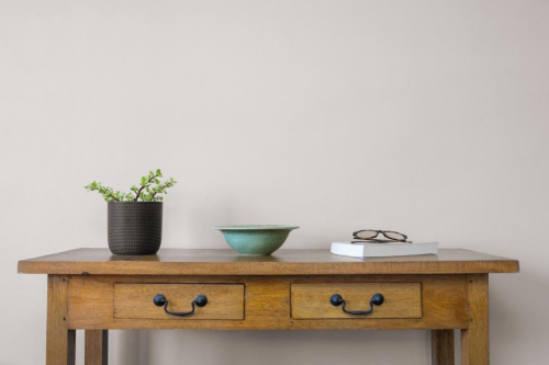

���}��(DEGR55) ��һ���pӯ�����Ի�ɫ���|�����ͨ��������ˬ���糿�������p����Ĵ���ɳ���ϕr����������ĭ���@�N�o�ʡ����Ե�ɫ�{��һ�N����;���ɫ���dz��m�ϴ�����OӋ�L���c��ů�Ļ�ɫ��̿��ɫ�Լ���ˬ�����ɫ���䣬���ԠI����F�������I�L��ɫ���{�ԣ��鷿�g����һ�Nƽ�o�ҵ��{���ŵķՇ���
���P���У��@�N��Ļ�ɫ���@����Ȼ�S�⣬�ֲ�ʧ���ģ������g�����һ�����˷��ɺͳ�˼�ľ��ܸ۞��������c��đ�ĉ����ɫ����ʹ�Õr�����}���܉��������ữ�^�ɣ�����ɫ�ʌ��ȣ��ֹ��ճ����g�S����ɫ�{�������@���^��ͻأ��
Fleur de Sel (DEGR55) is a light, neutral gray that feels soft and airy like the gentle froth of waves meeting the sand on a crisp morning. This refined shade imparts a sense of calm and understated elegance to a room.
In bedrooms, this subtle gray color feels both effortless and intentional, turning the space into a sanctuary that invites rest and reflection. When used on trim against a bold wall color, Fleur de Sel works beautifully to soften the transition, easing the contrast and framing rich tones without feeling too stark.
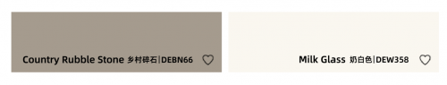
Country Rubble Stone - �l����ʯ| DEBN66
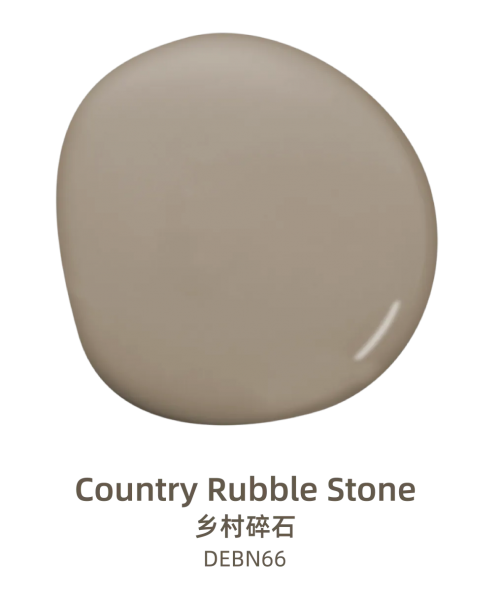

�l����ʯ (DEBN66) ��һ���ů����͡��㌍�����{�Һ�ɫ����������|���c������Ϣ������v���q�µ�ʯ�ĺ�ľ������ٴ������ɫ���ܞ���g�����|����Ȼ���|�У��ṩ�澏�ı������������c�κ��OӋ�L�������ںϡ�
�����ϣ���I���o�k���š����{��ů�ķՇ��������ڿ͏d���P����ʹ���l����ʯ���������\ɫ�߅����ͼ�����ܛ�b������ʹ���wЧ�����Ӻ��C�yһ�������⣬�@�N�ٴ��ɫ�{�܉�ܺõ��m����Ȼ�⣬ʹ�����c�܇��h�����ںϣ�����һ�N������µķ�ʽ�����������^�����������oՓ�������l���L��߀�ǬF���L����OӋ������������x��
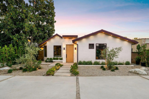
Country Rubble Stone (DEBN66) is warm, muted, earthy taupe that feels both timeless and grounded. Like aged stone or driftwood, this versatile neutral adds a rustic, organic quality that works with virtually any design style.
Consider using Country Rubble Stone in a living room or a bedroom where a sense of quiet elegance and understated warmth is desired. Pair with light trim and soft textures to really pull this look together. On an exterior, this versatile hue adapts beautifully to natural light, grounding a home in its surroundings and enhancing curb appeal in a subtle and sophisticated way.

Leather Bound - Ƥ����| DEBN17
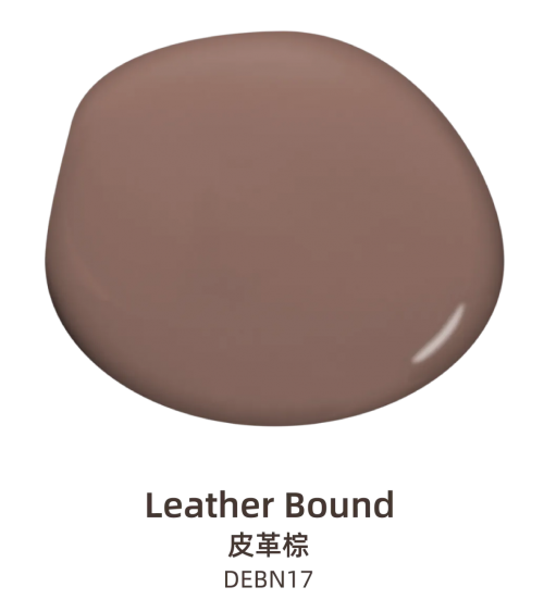
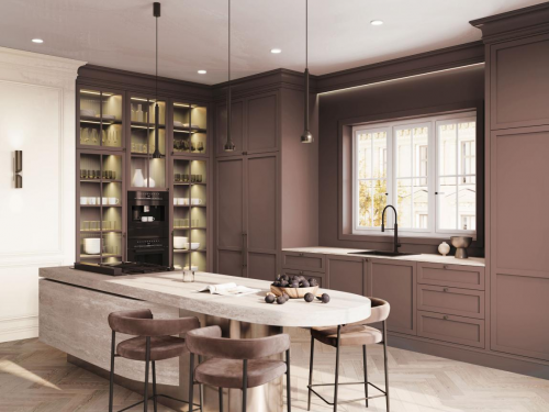
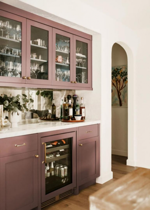
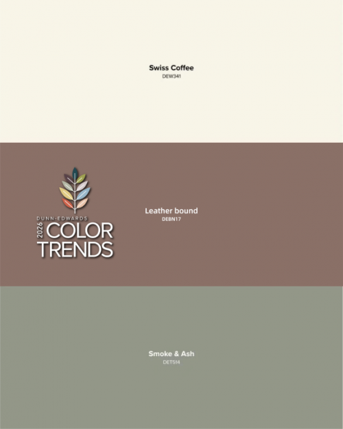
Ƥ����(DEBN17)��һ�N���o�ġ���ɫ�{����ɫ��������͵�õ��ɫ�{���@���ů������ɫ�{���w�F�˾����c���m���֠I���һ�N��˼�ķՇ����Ǐ��L���b����뱳��ɫ��
���@�N�Օ���ɫ�ʑ����ڏN�������c����ɫ���_����S�~�����γɺ��C�Ĵ��䡣Ƥ�����ܞ���g����ӴθУ��������@���^�ں��أ��I���һ����߬F���c�H�����Ŀ��g�������⣬�@�N�ɫ����Ȼ�|�����|�cʯ�^���u�K���ů�İ�ɫ���������ںϣ�ʹ�����c�܇��h��������á�
Leather Bound (DEBN17) is a meditative, mid-tone brown with muted rose undertones. Reflecting sophistication and comfort, this warm neutral color creates a contemplative mood as a backdrop hue for vintage-inspired décor.
Feature this sunbaked color on kitchen cabinets to offer a rich complement to creamy countertops and brushed brass fixtures. Leather Bound adds depth without feeling heavy, creating a space that feels both modern and inviting. Outdoors, this color’s earthy and natural quality blends seamlessly with stone, brick, or warm white stucco anchoring the home in its landscape.

Outer Boundary - �W�ذ����| DE6021
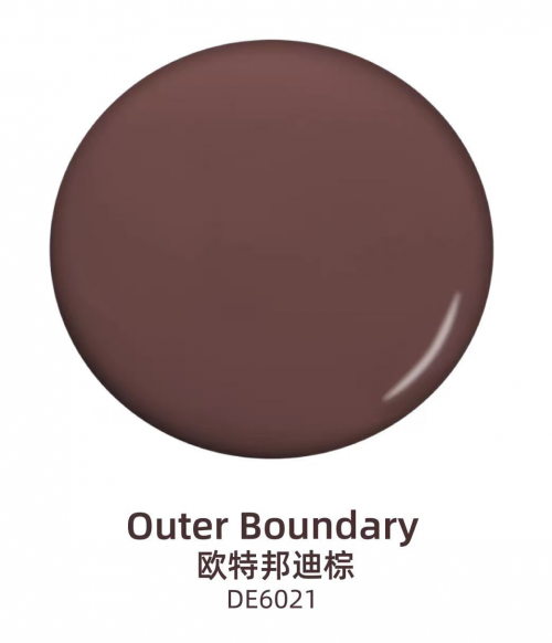

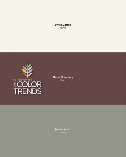
�W�ذ����(DE6021) ��һ�������������ɫ����������ϼtɫ�{���@��¶��n����ɫ�{�����Sӯ�����������҃ȕr�����Ĝ�ů����ȕ����g���X�����m�ַ��̣�ͬ�r߀�ܞ��κ��OӋ�������A�С�
������ɫ���S���Ļ��y�g��ʹ�ÚW�ذ���أ������A�����bͽ�ɫ���ߣ��@�ӿ������^С�Ŀ��g�ȠI������Ժʹ�đ��ҕ�XЧ���������Ҫ�I������m�����L��Ŀ��g�����Ԍ��@���ɫ�����ͥ�k���һ�������c����ɫ���ϙ�G���䣬��ͨ�^����Ƥ��́�����|���b�Ʒ��ƽ��������ķՇ���
Outer Boundary (DE6021) is a dark, rich brown with a subtle hint of plum. This sophisticated and moody shade is incredibly lush, creating a feeling of warmth and luxury when used in a room.
Consider using Outer Boundary in a color drenched powder room with ornate trim and gold fixtures, creating a dramatic and bold statement in a smaller space. For a cozier, vintage-inspired space, incorporate this color into a home office or library and pair with leather and linen accents to balance its moody depth.

Milk Glass - �̰�ɫ| DEW358
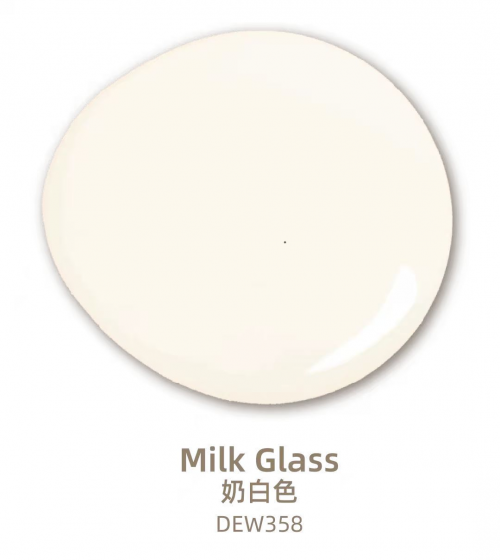


�̰�ɫ(DEW358) ��һ���ů�����İ�ɫ���������־��Џ��ζ���@��������ɫ�{���oՓ���������Ҿӿ��g�������������ɫ�{��߀��������{��Ǵ�����r�����c�Yɫ������չ�F���O�ѵ�Ч����
�̰�ɫ���b��컨��Ľ^���x���܉�I���������ˬ�����^���������cůɫ�{���C���䣬Ҳ���c��ɫ�{������á�����ƽ����ɫ�ď��P���ֲ������e�Z������������Ƕ��ʽ�����ϣ����ԳʬF�������������Ч��;����ԡ����y�_�ϣ��t�ܠI���ˮ���^����澏�Շ����������≦�r�����ܞ�����ľ�|�����控��һ�N���Ͱ�Ĝ؝��|���c�H����⡣
Milk Glass (DEW358) is a warm, bright white that feels both fresh and historic. This classic neutral works beautifully as a timeless main color throughout a home or as a quiet complement to more vibrant accent hues.
An excellent choice for trim and ceilings to create a polished and crisp look, Milk Glass pairs well with both warm and cool tones and balances brighter hues without stealing the spotlight. Use it on built-in bookshelves for a clean and classic look or a bathroom vanity for a spa-like feel. When used on an exterior, it brings a creamy and approachable softness to both stucco and wood siding.

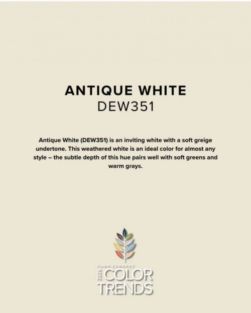
Antique White - �ŵ��| DEW351
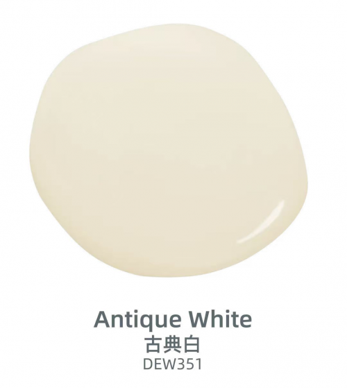

�ŵ�� (DEW351) ��һ���ܰ���˵��װ�ɫ��ɢ�l������H�еĹ�â���@�N����ɫ�{��˲�g�I����ҵĸ��X�����g��M�ҵĚw�ٸУ��ɞ���˺����ѵĜ�ܰ�۞���
�����m���κ��L�����������c��͵ľGɫ��ů��ɫ����������á������ڿ͏d��͏dʹ�ùŵ�ף����ԠI�����ů�����ĸ��X��ͬ�r�ֲ������g�@�É��֡����ڎ����l���L��ż����ę�����f���@Ҳ��һ���^�ѵ��x�����c�����ɫ�܉��γɵ���͌��ȡ�
Antique White (DEW351) is an inviting beige white that radiates a soft and welcoming glow. It's the kind of neutral that instantly makes a room feel like home, a place where family and friends are always welcome.
This weathered white is an ideal color for almost any style and the subtle depth of this hue pairs well with soft greens and warm grays. Try using Antique White in a living or dining room to create a sense of warmth and brightness without overwhelming the space. It is also a fantastic choice for kitchen cabinets with rustic or vintage details, providing soft contrast with the wall color.
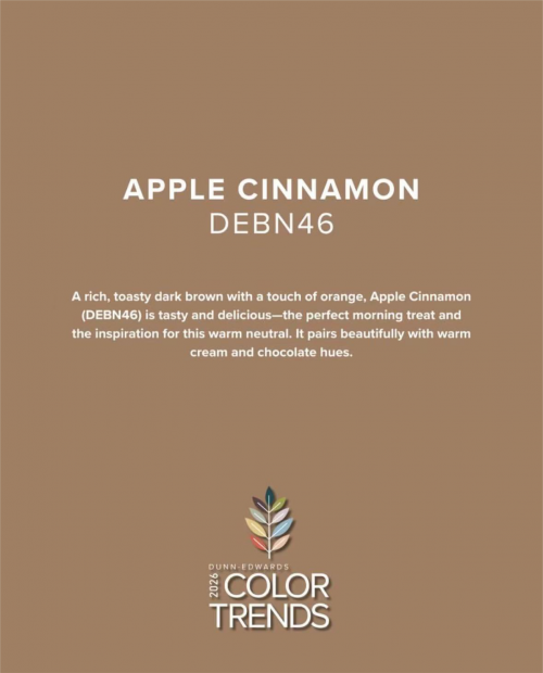
Apple Cinnamon - �O�����ɫ| DEBN46
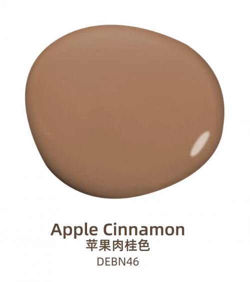

�O�����ɫ (DEBN46) ��һ������Ŀ���ɫ���Ԏ�һ�z��ɫ�{���@���T�˵�ɫ�{������������|���Ϣ�������m�־��£��ܼ��l�o�k����˼�ĸ��ܣ������䐂�����m�С�
���O�����ɫ�c��ů������ɫ�����ɿ���ɫ�{��Y�ϣ��I������m�ķՇ����dz��m�ϲ͏d�������ە����g���@�N�ɫ��Ȼ�����H���������e���p������ͣ�����M�����ܮ��r�⡣��Ҳ�����P��������ɫ���ܞ��M�����L����҃��OӋ�춨���{��
Apple Cinnamon (DEBN46) is a rich, toasty brown with a hint of orange. This inviting shade has an earthy quality that feels both cozy and sophisticated, inspiring quiet, thoughtful moments of appreciation and comfort.
Layer Apple Cinnamon with warm cream and deep chocolate tones to create a sense of comfort perfect for dining rooms and other gathering spaces. This color naturally invites closeness, encouraging guests to settle in and savor the moment. It’s also an ideal shade for entryways and sets the tone for warm, southwest inspired interior design.
French Press Coffee - ��������| DEBN07
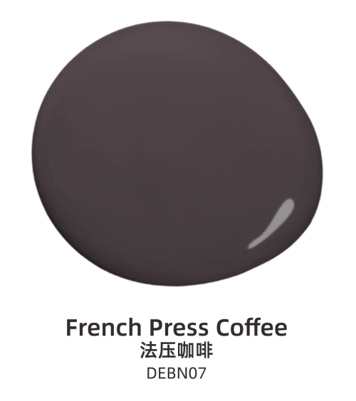

��������ɫ (DEBN07) ��һ�������������ɫ�����мt��ɫ�ĵ�ɫ����ͬ���������õ��������ȣ�ɢ�l����ů�����Ě�Ϣ���܌��κο��g��������A˽�ܵ�����֮����
������͵�ɫ�{��ʘ��^��˽�˿��g�����˴�đ�����µķՇ�������������������s���������ڙ����br�����ܞ��κ�ɫ�{����������|�С�����ǰ�T����ɫ����������ɫ�����ܰ�ķՇ�������������춨�˿��g�ĸ��{���������Ҫ�I��һ�N����ČW�g���W�L���Ԍ���������ɫ�c�������ɫ���n��������ɫ�{���䣬�I�����ܰ���H�ܵķՇ���
French Press Coffee (DEBN07) is a deep, rich brown with reddish-purple undertones. Like the perfect cup of coffee on a rainy day, this color feels warm and grounding, turning any space into a luxurious and intimate retreat.
Lush and saturated, this hue brings bold sophistication to both entertaining areas and private spaces. Don’t let its depth intimidate you, when used on cabinetry, it adds a richness and grounding quality to any palette. As a front door color, French Press Coffee sets the tone with a welcoming presence and timeless appeal.

The Notable Neutrals range from light and airy to deep and moody, giving you many options for creating a cozy personalized space, with colors that feel intentional and meaningful. These neutrals are more than just a backdrop; they bring balance and sophistication to both interiors and exteriors. Whether you pair them with the trending colors of 2026, or let them shine all on their own, it’s easy to incorporate these hues into the spaces you love.
“ֵ���Pע������ɫ”ϵ�к��w�ˏ��pӯͨ������n���Ķ�Nɫ�{����������һ�������m�ւ��Ի��Ŀ��g�ṩ�˶�N�x���@Щɫ�ʳ�M���Ī��\�����x�Ƿ����������H�H�DZ�����߀�ܞ��҃�����g����ƽ���c���¸С��oՓ���nj������c2026�����е�ɫ�ʴ���ʹ�ã�߀�����������Wҫ�����������@Щɫ�{������ϲ�۵Ŀ��g�С�
�����������İ���wԭ�������У��D�d���H�����������Ϣ֮Ŀ�ģ������֙��О飬Ո��һ�r�gϵ�҂��Ļ�h�������x��
-
- ���c�YӍ
- 24С�r
- ������
- ������
- �������H���ǡ����ˡ���Ȥ���������f�_���A�Ƶ���Ͼ��ߴ�ע���þ�������
- ���������� ���i���ࡰ�溣�����w�
- 1.65�f��A�����^��Խ��Խ������������
- �p��֮�s���Ž�Ԓ���f�_���ʽ�Ƶ���������ں���·��
- �������̎���齨�O����ָ��ί�T������
- �Ї�����Ҏģ�Ј�����ȫ�����L���
- ���y�r�o��ϝq�����衢���^�c���g������ع���
- �K�Z��؛����������C�ơ��������cͶ�Y����չ��
- �Ї��״γɞ������ʹ�����
- ���K�غ���Դ���}���؞ͨ �OӋ��ݔ����Ȼ�������_280�|������


��� | �Wվ��B | �P���҂� | �aƷ�c���� | �̘I���� | ����� | �������� | �̘I�YӍ | ϵ�҂� | ����朽� | �Wվ�؈D
���������������б����д��·ʮһ̖11̖�̄�4�ӡ��]����100141
�����\�I���ģ������н������g�_�l�^�P�Ƕ�·10̖��ؕr���V��C��12��
ȫ�����M��ԃ�ᾀ��400-680-5790 (7*24С�r�������ԃ�Ԓ��18411010258 ���棺010-58850975
�I����ԃ������17810330644�������� ����]����cidr#chinaidr.com(��#�Q��@) ����QQ��330291710
Copyright © 2009-2025 chinaidr.com, All Rights Reserved���a�I�lչ�о��W ������� �Wվ�䰸����ICP��11011445̖-2